


Who.
These guidelines are for anyone using the Mozilla brand for any marketing, communications, or inter-company messaging. Approved brand assets, instructions, and brand samples will help set you up for success.

01
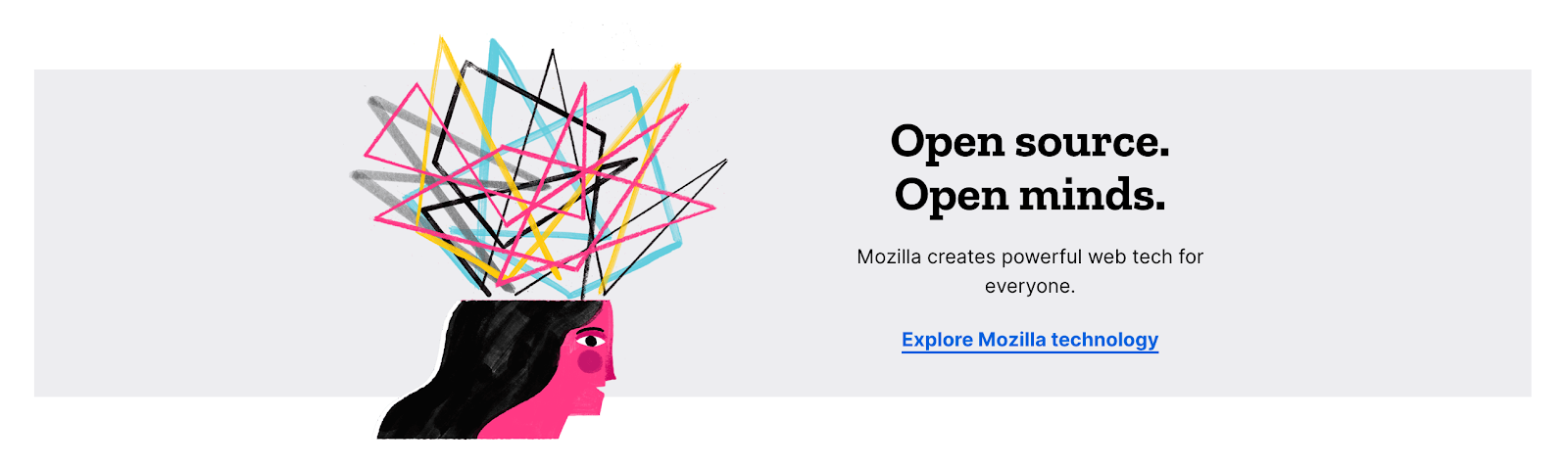
Mozilla fights for the internet
Who.
These guidelines are for anyone using the Mozilla brand for any marketing, communications, or inter-company messaging. Approved brand assets, instructions, and brand samples will help set you up for success.
Why.
These guidelines are for anyone using the Mozilla brand for any marketing, communications, or inter-company messaging. Approved brand assets, instructions, and brand samples will help set you up for success.
Dos & Don’ts
Here are some general guidelines for using Mozilla brand assets in practice. Use the logos, colors, typefaces, and approved artwork found in the assets section. Please refrain from manipulating or recreating any the approved brand artwork.
Do
Do follow all guidelines and utilize all resources and approved assets.
Do respect the original arrangement, spacing, colors with all brand assets so they are displayed consistently and uniformly.
Do maintain the shape, structure, and integrity of each brand asset.
Do use assets at recommended sizes and ensure when used small they are clear and legible.
Do reach out to our brand team or FAQ section if you have any questions or uncertainty.
Don’t
Don’t modify or attempt to recreate any Mozilla brand assets in any way.
Don’t use any brand assets sourced from anywhere except approved the brand guidelines library downloads section.
Don’t use the Mozilla brand, logo, or brand partnerships to represent anything that contradicts our brand values.
Don’t use the Mozilla logo in place of the word Mozilla in a sentence.
Don’t use the Mozilla logo in any way that makes it the largest or most prominent element on the page. Our logo speaks volumes at small sizes.
02
Because every brand needs words to live by
Opinion-
ated
Mozilla acts on its values and bucks convention
Optimistic
Mozilla is optimistic about the future Internet.
Human
Mozilla is in it for people, not profit.
Open
Mozilla practices transparency and participation.
Our brand personality guides the creative process for design so that we may effectively and consistently represent Mozilla everywhere we work.

Human
We are about the human experience first and foremost. Design should lead with empathy; sound and feel human; and connect to the greater goals and emotions we strive for.

Open
Experiences and designs should invite users to learn, participate and act. Keep things open, iterative and identify clear actions.

Opinionated
Create experiences and designs that get to the heart of the problem. Put the core content front and center. Give the user a clear and concrete experience.

Optimistic
Create experiences and designs that help users imagine the creative future of the internet. Be playful, be weird, appeal to the imagination.
03
With the internet at its core
The internet is a modular tool and in that spirit we created a modular identity. We built our logo from a single pixel, seen in the colon, and used highlighted type inspired by programming language. Both of these elements form the building blocks of the internet. By baking them into the foundation of our logo, we have inserted that original creative and maker spirit into our system and our brand.
PLEASE NOTE THAT THE MOZILLA LOGO CONSISTS OF THE WORD INSIDE A SURROUNDING RECTANGLE. Do not use the word alone as the logo. If you intend to use the logo on black or a dark color, please choose the version of the logo with the white rectangle so that the entire logo, including the rectangle, is visible.
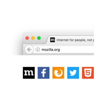
Social media icons and favicons
The logo can be typed out using our font Zilla Slab Highlight. It’s available as an Open Source font on GitHub and Google Fonts. Simply type out “Mozilla” or “mozilla” using the bold weight, and the logo will appear.
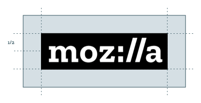
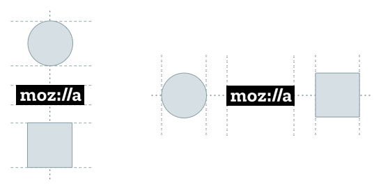
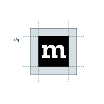
Clear space
To ensure our logo maintains legibility and integrity, always presereve a minimum clear between the logo and other elements.
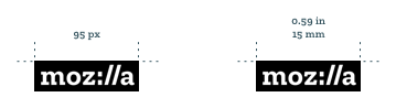
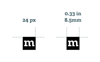
Minimum Size
Our logo is bold enough to be legible at even small sizes, but it should never appear smaller than the minimum size shown here for screen and print.
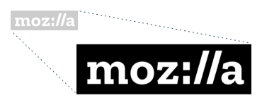
Scaling proportionally
The proportions of the logo should never be altered. To resize an approved logo or other asset from our library hold down the shift key when scaling to maintain the correct proportions.
Co-branding
When placing our logo next to other logos in horizontal or vertical orientation attempt to make all logos appear visually equivalent, with appropriate and visually consistent spacing.
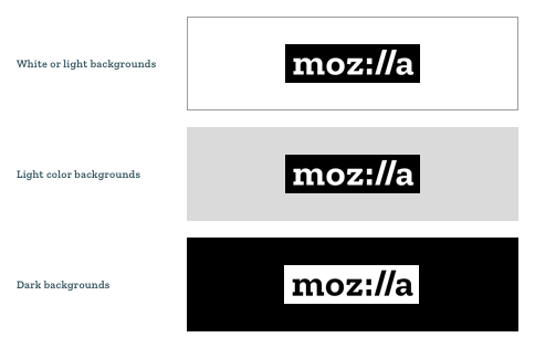
Background colors
Our primary logo (white type contained in a black rectangle ) should be used over most backgrounds. Do not use this logo on black or dark backgrounds! For darker backgrounds where the black rectangle may not be legible please use the logo with the white rectangle. The logo must always include the surrounding rectangle. Typing the word “Moz://a” using the Zilla font does not constitute our logo.
Spelling out our brand name
When using our brand name in a sentence please spell out the word Mozilla with a capital “M”. Place the logo somewhere else on the page, and only use the logo in one location per layout.
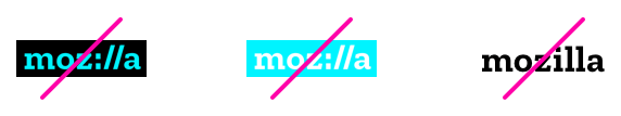
Never alter or manipulate our logo in any way. Only use approved brand assets in all cases.
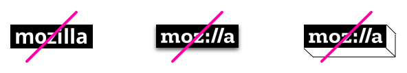
Never attempt to use a different typeface within a black box. Don’t add shadows or any other effects to the logo.
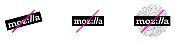
Never skew the logo at an angle, stretch or compress the logo, or obscure the legibility of the logo in any way.
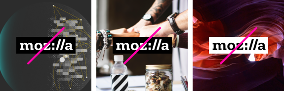
Do not use the primary black and white logo on a dark background that obscures the legibility of the containing shape. Do not use the primary black and white logo on an overly busy photographic background. Do not use the one color white logo with black or any other color type within the containing shape.
Logo do’s
Do place official logo files within your design.
The letters and surrounding rectangle makeup the logo and must always appear together.
Do make sure the logo has enough contrast with the background.
Do place the logo on a non-busy area within a photo.
Do make sure you always have the highlight and the letters present.
When you’re making a sentence with the word Mozilla, make sure to spell out the full word and not rely on the graphic.
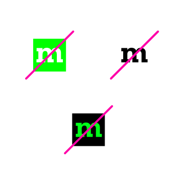
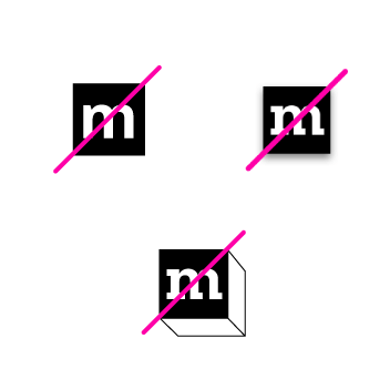
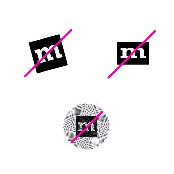
Logo don’ts
Do not make your own logo.
Do not use the word Mozilla without its surrounding box.
Do not use the black rectangle version on dark backgrounds; use the white rectangle version in that case.
Do not remove the highlight from the letters, ever.
Do not change the color of the logo, ever.
Do not place the logo on a busy background.
Do not add any elements to the logo.
Do not change any element of the logo–the letter nor the highlight shape around them.
Do not make sentences with the logo inside.
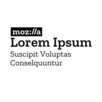
Primary logo lockup
When pairing the logo in a lockup always use Zilla SemiBold placed flush left above the wordmark. This is the recommended and primary setting for most products, projects, initiatives, partnerships, open standards, teams, internal products, communities, and events.
The recommended arrangement places our logo below the text in such a way that the brand can fully support the relationship as a platform.
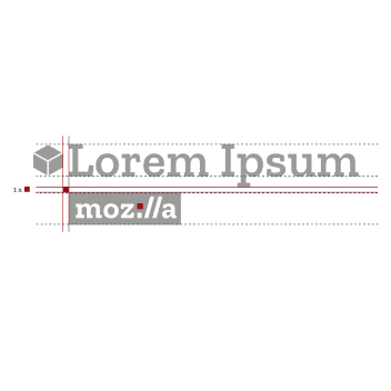
Limited use lockup with icon
In certain rare instances your logo lockup will have to be arranged with an icon. If your design assets include associated iconography we still encourage the use of the Primary logo lockup while using the icon elsewhere on the page. If it is not possible to use the icon elsewhere as part of your layout then the icon can be added directly to the left of the top line of text. Please follow the sizing specifications to the right.

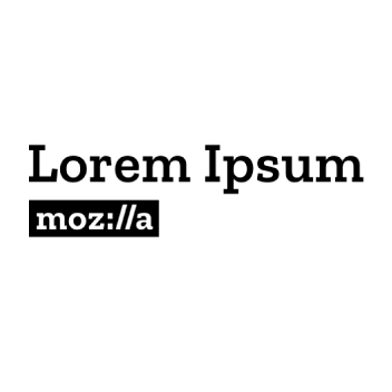
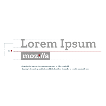
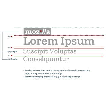
Limited use lockup with secondary text
In very rare cases your logo lockup will require a second level of text beneath the main text. The secondary text should be set in Zilla Slab Regular and sized to 3/5 the height of the logo. This is the only use case where the logo will sit stop the supporting text and therefore it is not recommended unless absolutely necessary. Please follow all size and spacing specifications and do not add any additional elements to this arrangement, or use this lockup without a secondary level of typography.
The Mozilla icon uses the iconic “m” from our logo. They follow the same rules as the logo: they appear with a black box and white lettering.
two-color black and white icon.
one-color black icon.
one-color white icon.
Icon size
The Mozilla icon is reserved for social media applications, favicons, and in specific instances where the full Mozilla logo does not work due to size or format.
Clear Space
To ensure our logo maintains legibility and integrity, always presereve a minimum clear between the logo and other elements.
Minimum Size
The icon is bold enough to be legible at even small sizes, but it should never appear smaller than the minimum size shown here for screen and and in limited cases print.
Never alter or manipulate our icon in any way. Only use approved brand assets in all cases.
Never attempt to use a different m within a black box. Don’t add shadows or any other effects to the logo.
Never skew the icon at an angle, stretch or compress the icon, or obscure the legibility of the icon in any way.
Logo usage and expressing our logo in text
Our logo lockups never include qualifying language, like supported by, by, from, or in partnership with. The logo placement below the name shows that Mozilla is supporting the project. Qualifying language for all projects should be used only in copy, when the name of the project is written out, not in the naming lockup.
We should not rush to strip the Mozilla name off projects where others are involved simply because others are contributing. Part of what Mozilla stands for is being open, for the benefit of all. We should work toward an understanding that if you see the Mozilla logo on a project, it doesn’t preclude us working with others or inviting collaboration.
Do
Do spell out our brand name Mozilla in the same type size and type setting as the content that immediately surrounds it.
Do capitalize the “M” in Mozilla when typing it out, unless it is part of a web address.
Don’t
Don’t change the spelling of Mozilla, substitute typographic characters for symbols, pluralize our brand name, or abbreviate it in any way.
Don’t use the Mozilla logo in place of the name “Mozilla”, always spell the name out.
A Mozilla Creation
Place our brand name first in copy for a product, tool, service, project, or resource created by Mozilla. This ordering shows the strongest association with the Mozilla brand.
A Mozilla Product
In cases where a product, application, or service needs more independence than provided by previous options use this arrangement.
Projects by Mozilla
Project names precede our brand name, along with other tools, services, resources, or assets created by Mozilla.
Supported by Mozilla
This presentation can be used for partnerships such as grants we are making with teams or partners who create the majority of the work.
04
It’s all here in black and white

#000000
RGB: 0 / 0 / 0
CMYK: 30 / 20 / 20 / 100

#FFFFFF
RGB: 255 / 255 / 255
CMYK: 0 / 0 / 0 / 0

Pantone: 2197 C/U
CMYK: 54 / 00 / 12 / 0
RGB: 0 / 255 / 255
HEX: #00ffff

Pantone: Yellow C/U
CMYK: 0 / 0 / 81 / 0
RGB: 255 / 244 / 79
HEX: fff44f

Pantone: 178 C/U
CMYK: 0 / 80 / 47 / 0
RGB: 255 / 79 / 94
HEX: ff4f5e

Pantone: 3375 C/U
CMYK: 78 / 0 / 42 / 0
RGB: 84 / 255 / 189
HEX: #54ffbd

Pantone: 2603 C/U
CMYK: 63 / 84 / 0 / 30
RGB: 110 / 0 / 139
HEX: #6e008b

Pantone: 7721 C/U
CMYK: 100 / 0 / 41 / 48
RGB: 0 / 94 / 94
HEX: #005e5e

Pantone: 661 C/U
CMYK: 87 / 16 / 0 / 52
RGB: 0 / 69 / 139
HEX: #00458b

Pantone: Black 0961 C/U
CMYK: 49 / 31 / 33 / 0
RGB: 149 / 149 / 149
HEX: #959595

Pantone: 420 C/U
CMYK: 20 / 12 / 13 / 0
RGB: 231 / 229 / 226
HEX: #e7e5e2
Black and white swatches are the main grounding hues to the color palette. The darker hues and the neutral greys from the secondary palette are there to add harmony and balance to the primary color palette. When choosing a color scheme for a project, the colors from the primary color palette are the core and lead colors with the secondary palette adding support. As a starting point, we have put together examples of successful pairings below.


05
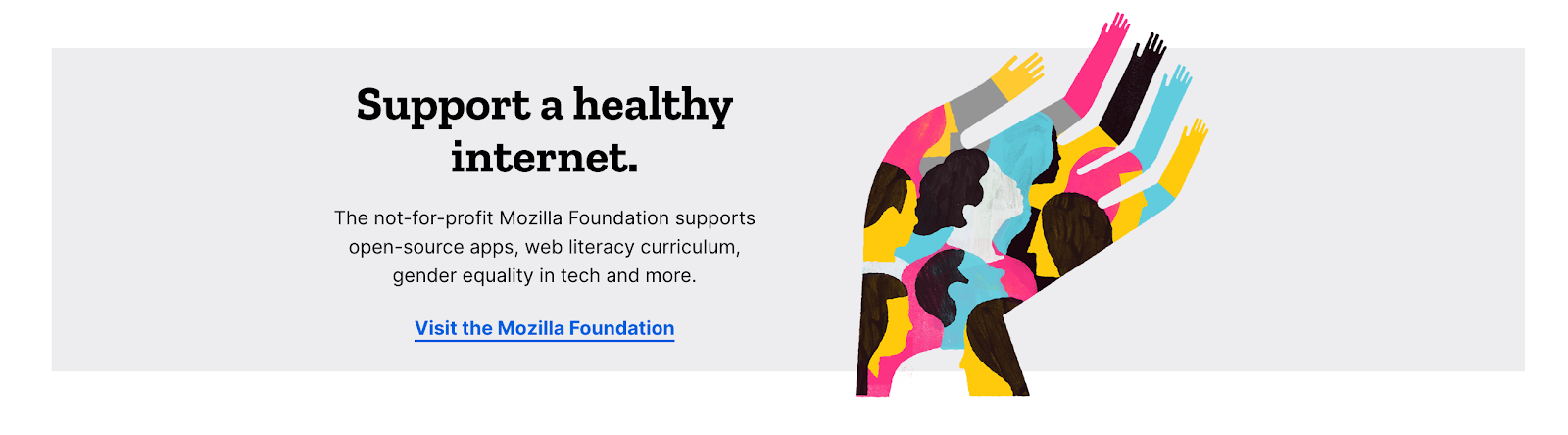
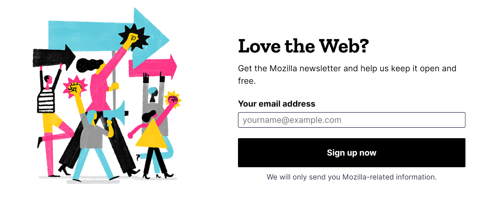
Illustrating the story of the web
The following visuals are not to be used without permission from Mozilla.
06
A font made for Mozilla (and everyone)
Zilla Slab
Zilla Slab is a casual and contemporary slab serif with a good amount of quirk. We’ve made it open source for everyone to use.
Learn about the making of Zilla
Zilla Slab Bold for Headings as used on this website:
Heading – XXL
Font size: 76px (4.75rem)
Line height: 76px (100%)
Heading – XL
Font size: 66px (4.125rem)
Line height: 66px (100%)
Heading – LG
Font size: 56px (3.5rem)
Line height: 56px (100%)
Heading – MD
Font size: 48px (3rem)
Line height: 48px (100%)
Heading – SM
Font size: 38px (2.375rem)
Line height: 40px (105%)
Heading – XS
Font size: 28px (1.75rem)
Line height: 30px (107%)
Heading – XXS
Font size: 24px (1.5rem)
Line height: 26px (108%)
Heading – XXXS
Font size: 18px (1.125rem)
Line height: 20px (111%)

